A Look Into the Shadow Glen Project!
Finally!!! The home on Shadow Glen Drive has been one of my absolute favorite projects over the years, and the day has finally come when I get to share what’s behind the doors!
When I first walked into this house, it was a blank slate—so exciting! No rug, no furniture…you get the gist. The client wanted it to be “an adult hang-out” where they could hang after a dinner party or while the kids were in the adjacent family room watching TV. Their only guidelines were that they wanted colorful, western, creative, and unexpected! I was like “hold my beer…” haha! Could a description be more me?!
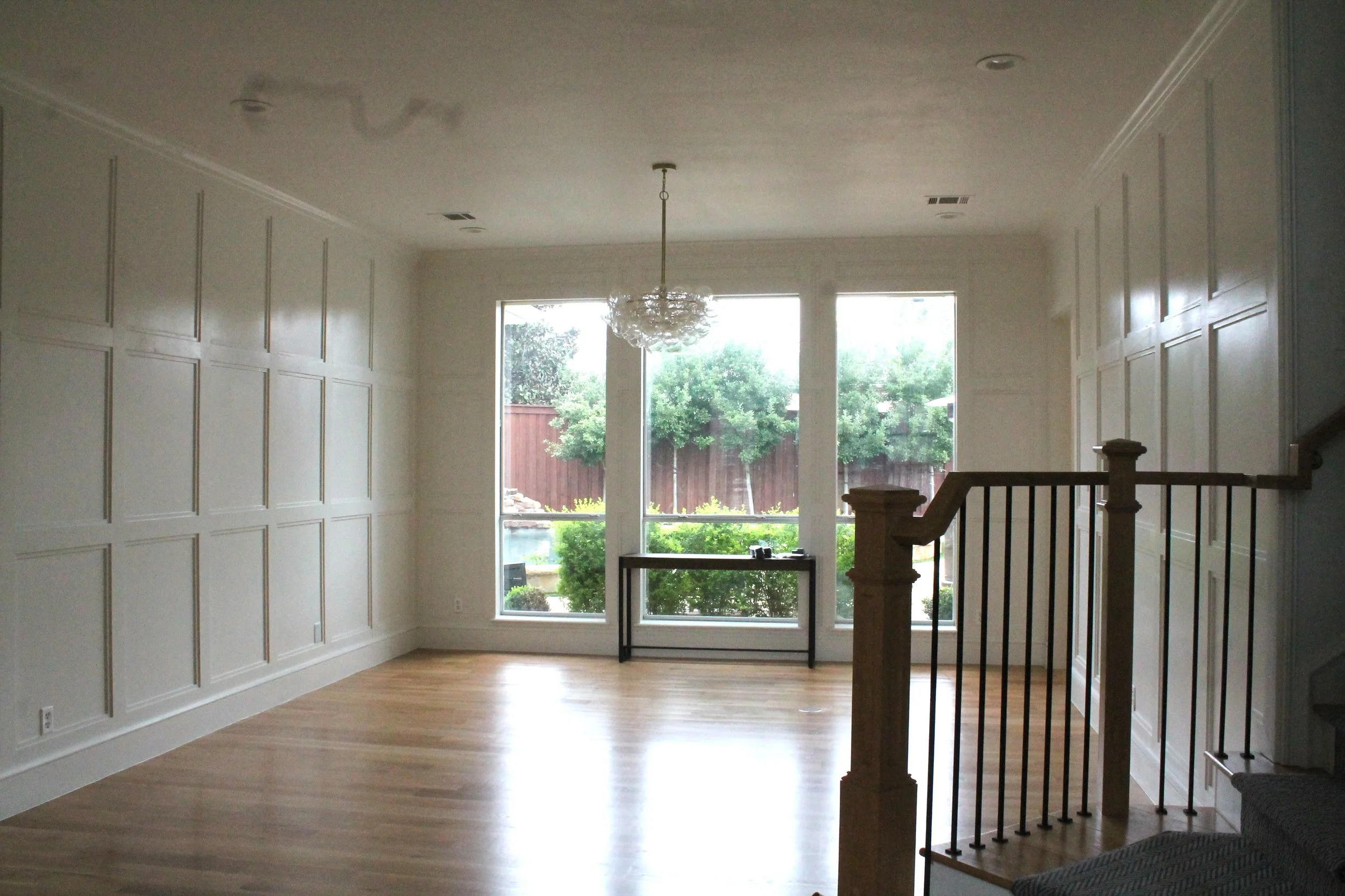
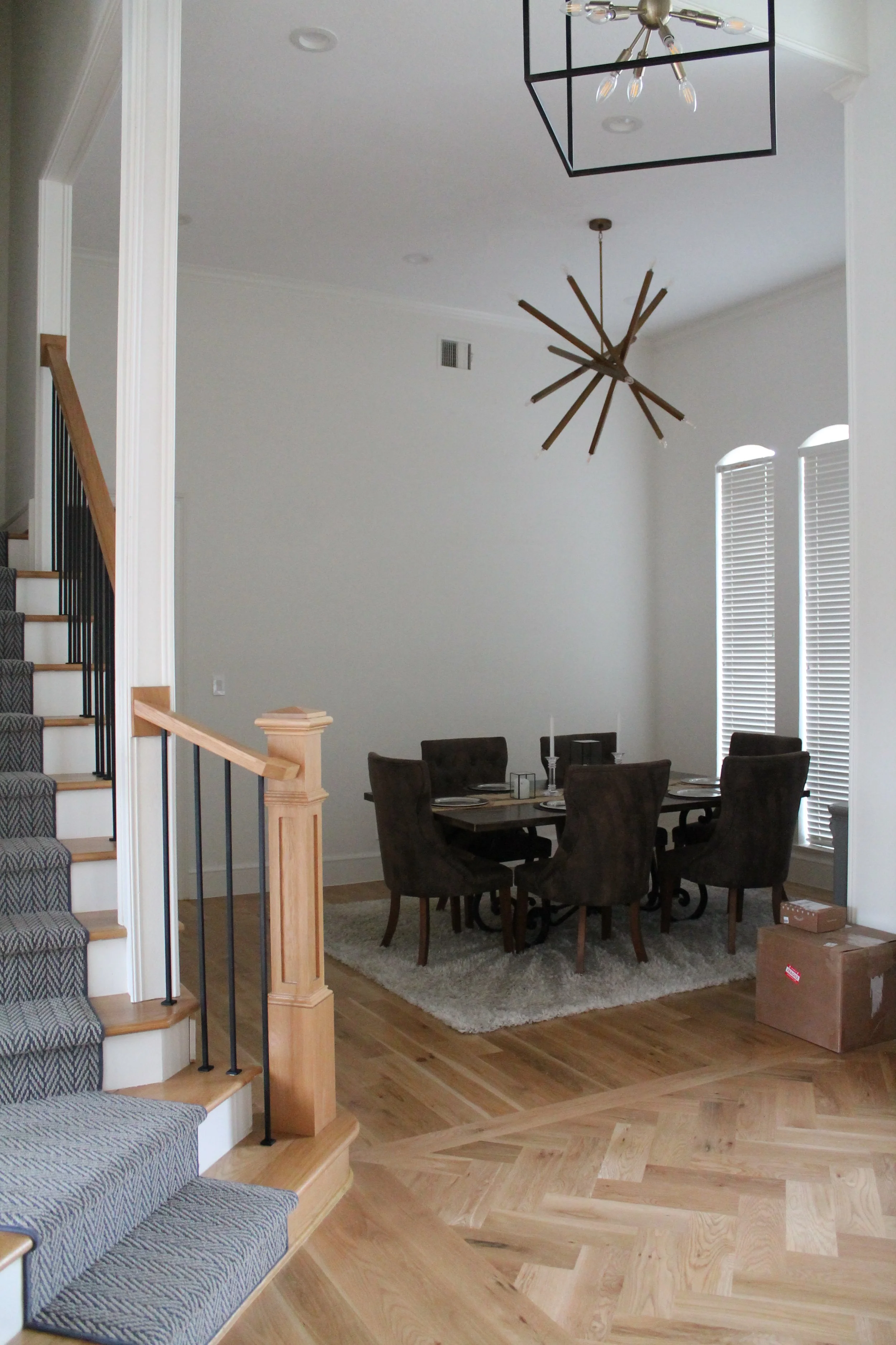
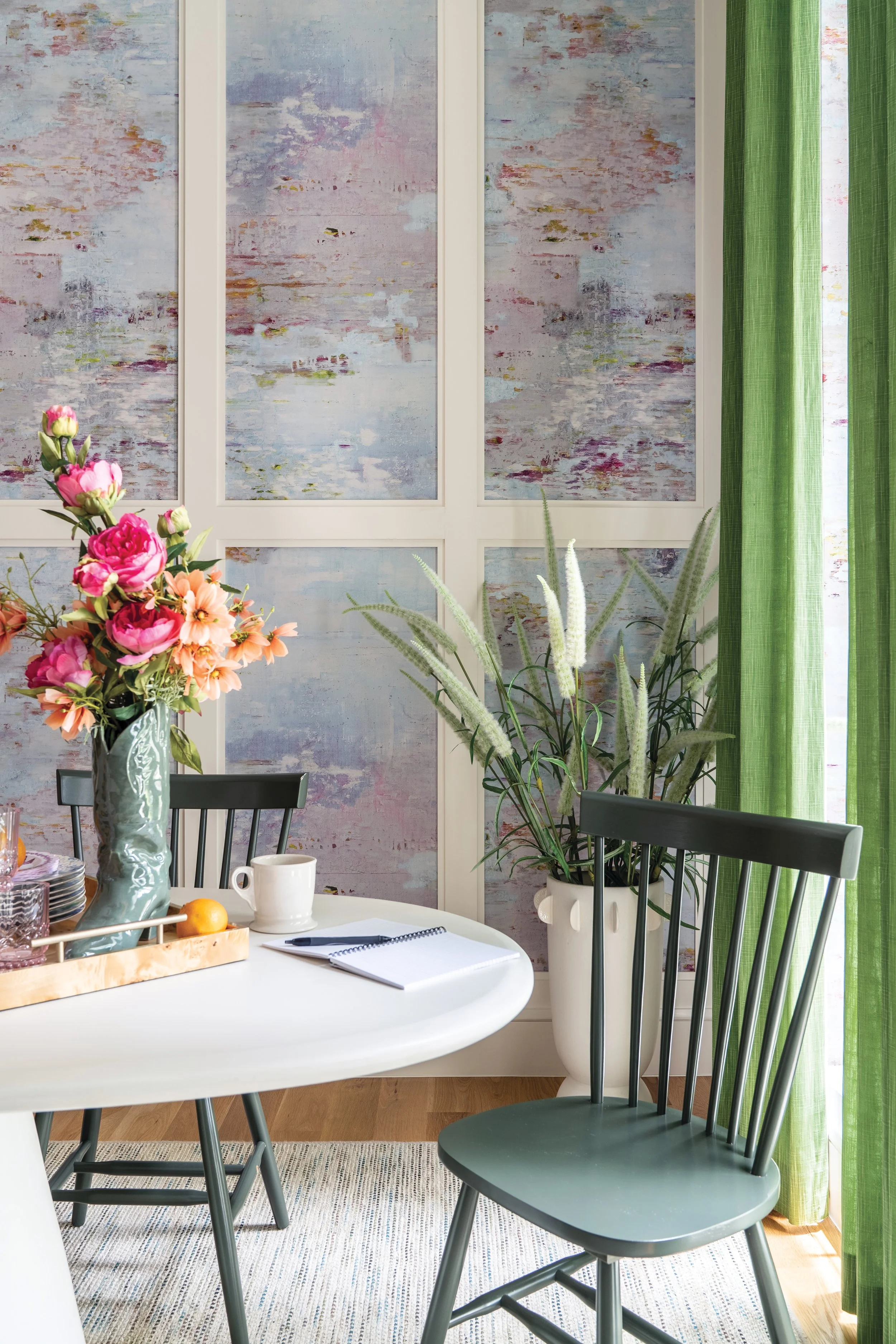
Knowing that color and pattern mixing were requested, I started by pulling fabrics and wallpapers to set my intentions. Where did I want to go? How would I get us there? I knew I wanted to add a wallpaper in the dining room so that it wasn’t just a tall, white box. There was already millwork paneling in the living room, so I decided to add the same type of millwork to the dining room, with wallpaper on the panels. That meant I’d need a loose print—not a small-scale geometric for the paper. When I found this, I knew it was the one!
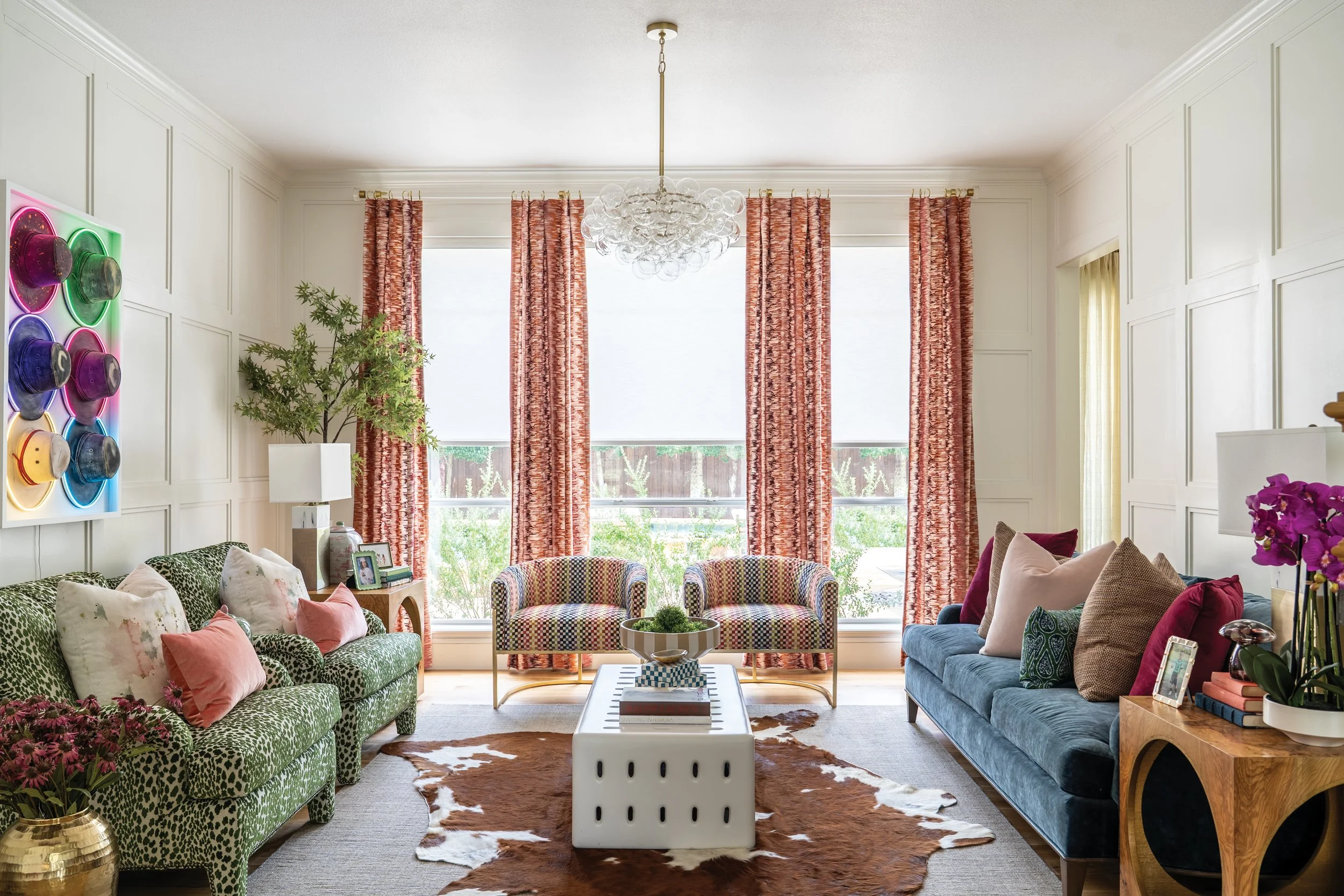
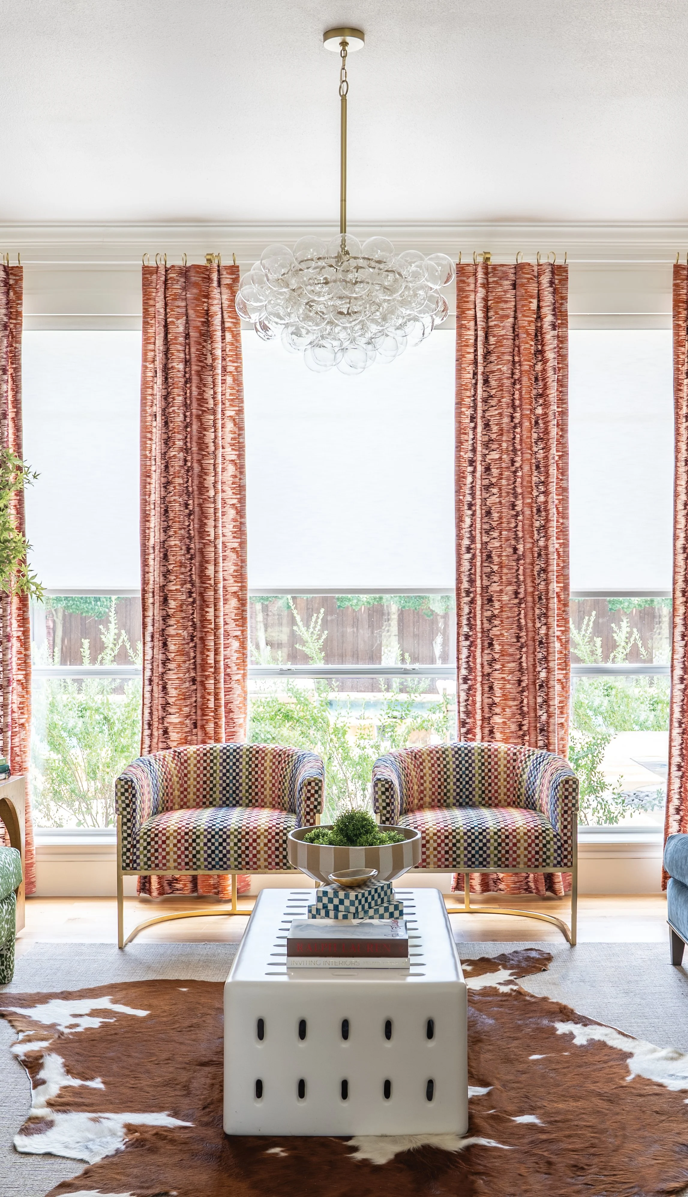
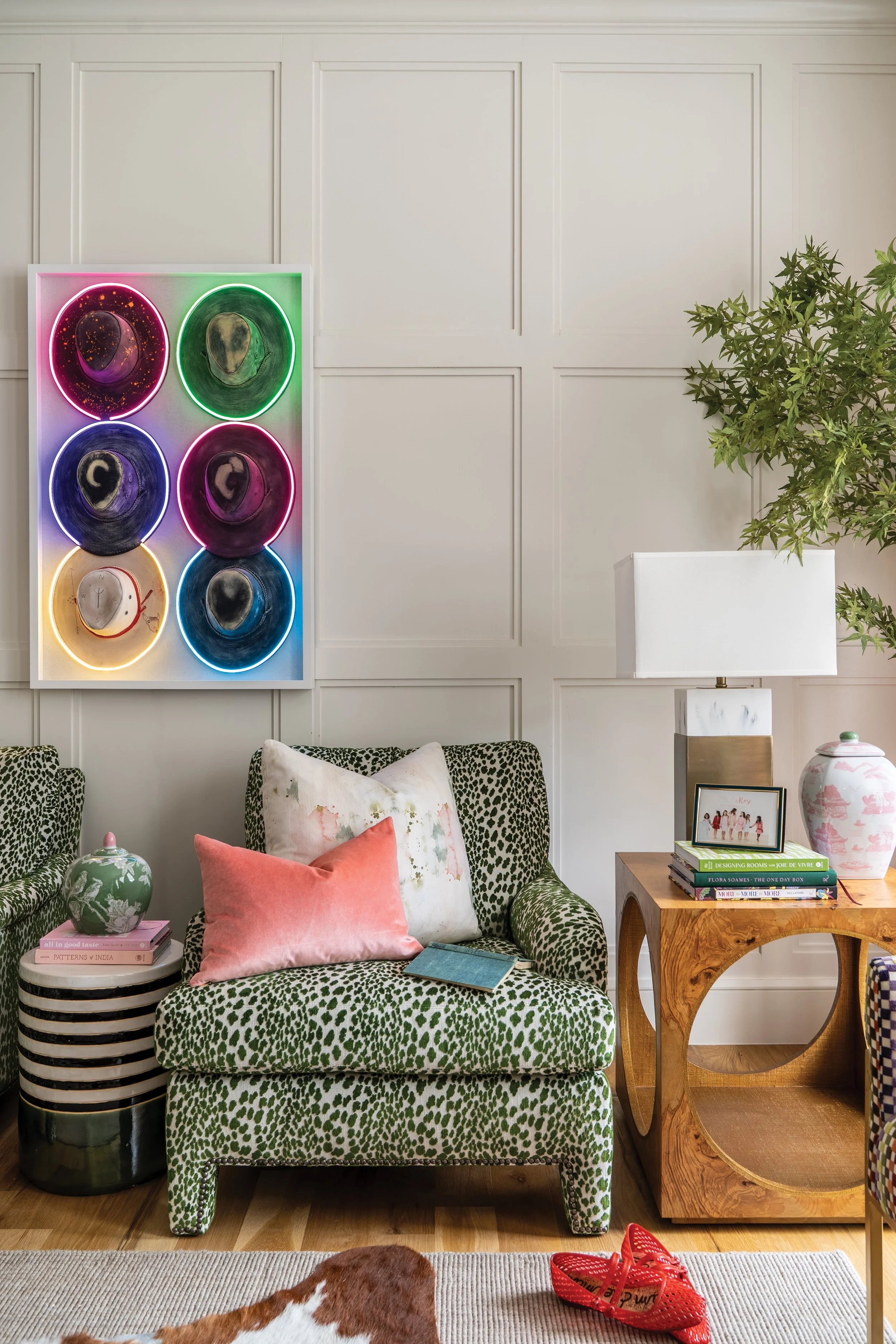
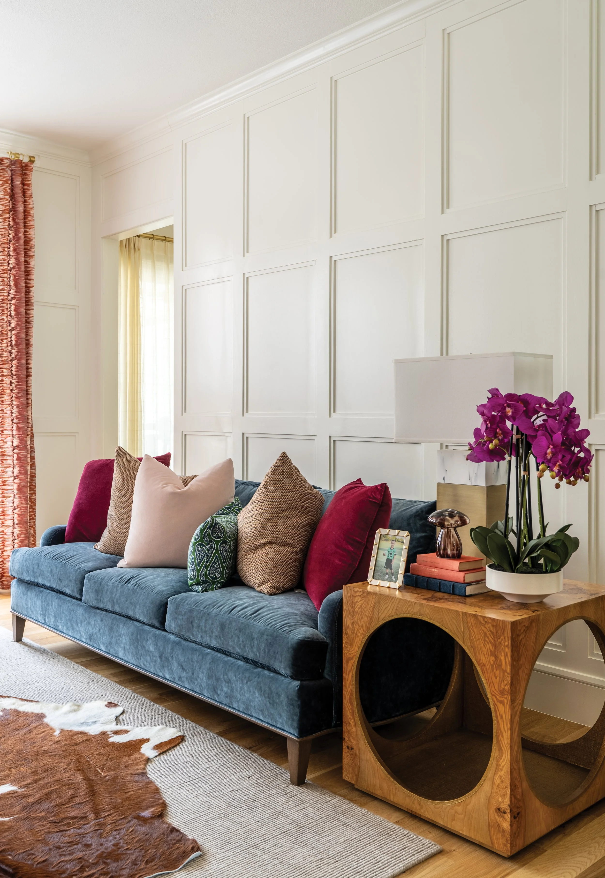
The same happened with the drapes in the living room—it was love at first sight! This Schumacher embroidered fabric was the perfect starting point for this room! The walls were simple white millwork and left space in our design for some real punch! Once I had that foundation of the drapes decided, I could add multiple colors and patterns and start mixing in a really bold way! Green leopard with blue velvet with a multicolored weave?! Yes, please!
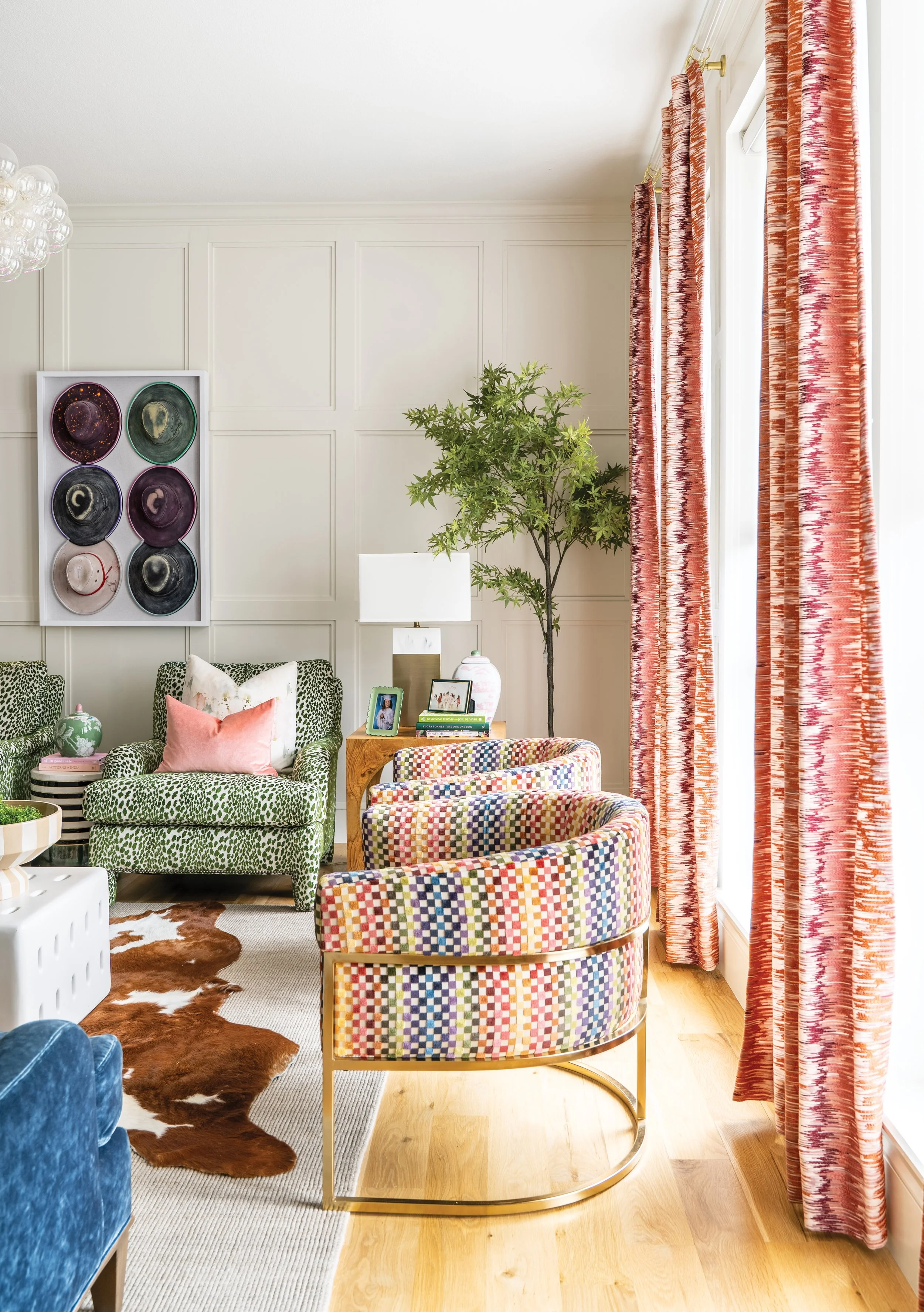
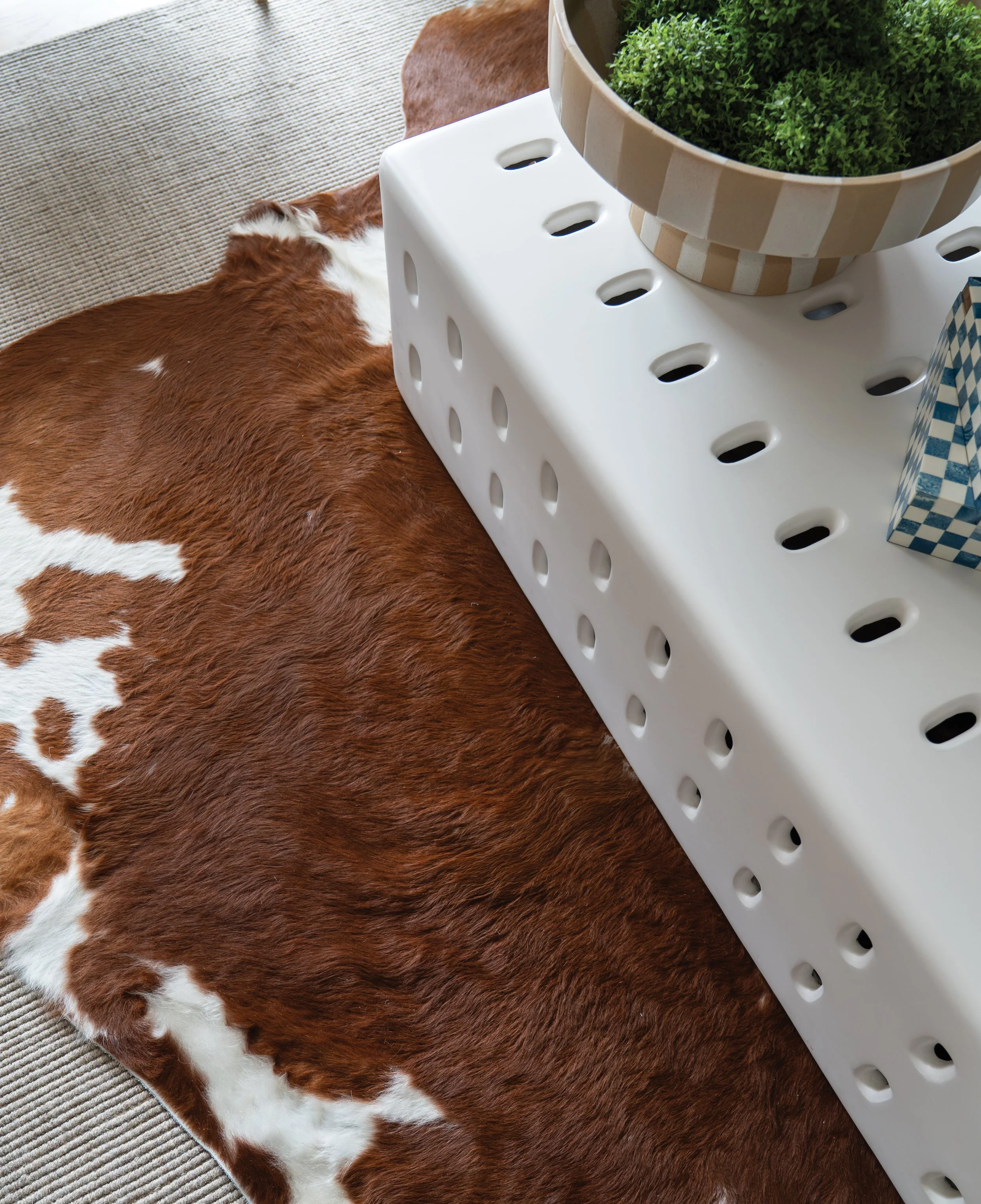
I wanted to bring the western element in with the rugs. We layered a sisal and a hide. The clients got to pick the hide on a date night to the stockyards! The organic shape of the hide helps us avoid square+square+square+rectangle in the other pieces. It adds an informality which was needed with the stunning drapes and elegant millwork!
Something you’ve heard me say many times is that we need a star and then a supporting cast. If everything were trying to be the star, nothing would stand out. Confusing hierarchy is bad design and isn’t helpful to the user or their guests! We made sure to have star chairs, supporting cast chairs, and an extra sofa. You can see that the intention is clear in the fabrics and shapes selected. I’ve also made clear which view comes first (the windows), then second (neon hats), then third (the sofa tucked behind the stairs). This helps your eye know where to go, where to land, and gives instructions on where to sit, etc.
Good design meets the client’s needs and helps them live the life they’re dreaming of. Now this client has a cool, adult living room to host the soccer team moms or tuck themselves in to read a book after their kids go to sleep. I hope the space gives them room to dream, create, and rest. Sarah tips her hat and nods, mounts up on her white horse, and rides off into the sunset.