An Interior Designer’s Top 5 Tips for Choosing Paint Colors
When was the last time you shopped for paint? Did you stand in the paint section of Home Depot, Pinterest inspiration in hand, confident you’d find the PERFECT color for your home? When you started sampling in the space, did every single color look different than you remembered? Or, God forbid, did you skip the sample step and paint all of your walls a color you ended up hating?! We’ve all been there, shopping for paint is HARD!
But at the end of the day, these selections may be some of the most important remodel decisions you’ll make! Why is that?? Paint is the foundation of establishing a color palette in your home. Choosing the right color can completely transform a room and set the mood of the space! I’ve pulled together some insider tips for you on how to choose the perfect colors to refresh your space!

1. How do you want your space to feel?
This may seem obvious, but before diving into paint samples, really think through what you want the space to feel like. Are you creating a calm and peaceful space where you can curl up and read a book? Or are you surrounded by a dark and cozy environment while you’re watching The Holiday? Certain colors can affect our behaviors and emotions, so it’s crucial to spend some time narrowing down the goals of the space you’re looking to refresh!
For a soft and restful space, you should lean towards cool, calming tones like light blues, muted greens, or warm neutrals. For a more intimate feel, deeper colors like navy and burgundy can add warmth and richness. Alternatively, if you’re seeking an energizing space (like an office or kitchen) where you can become the next Martha Stewart, bright and vibrant shades such as yellow can uplift the mood and inspire productivity.

2. Consider the size of your room
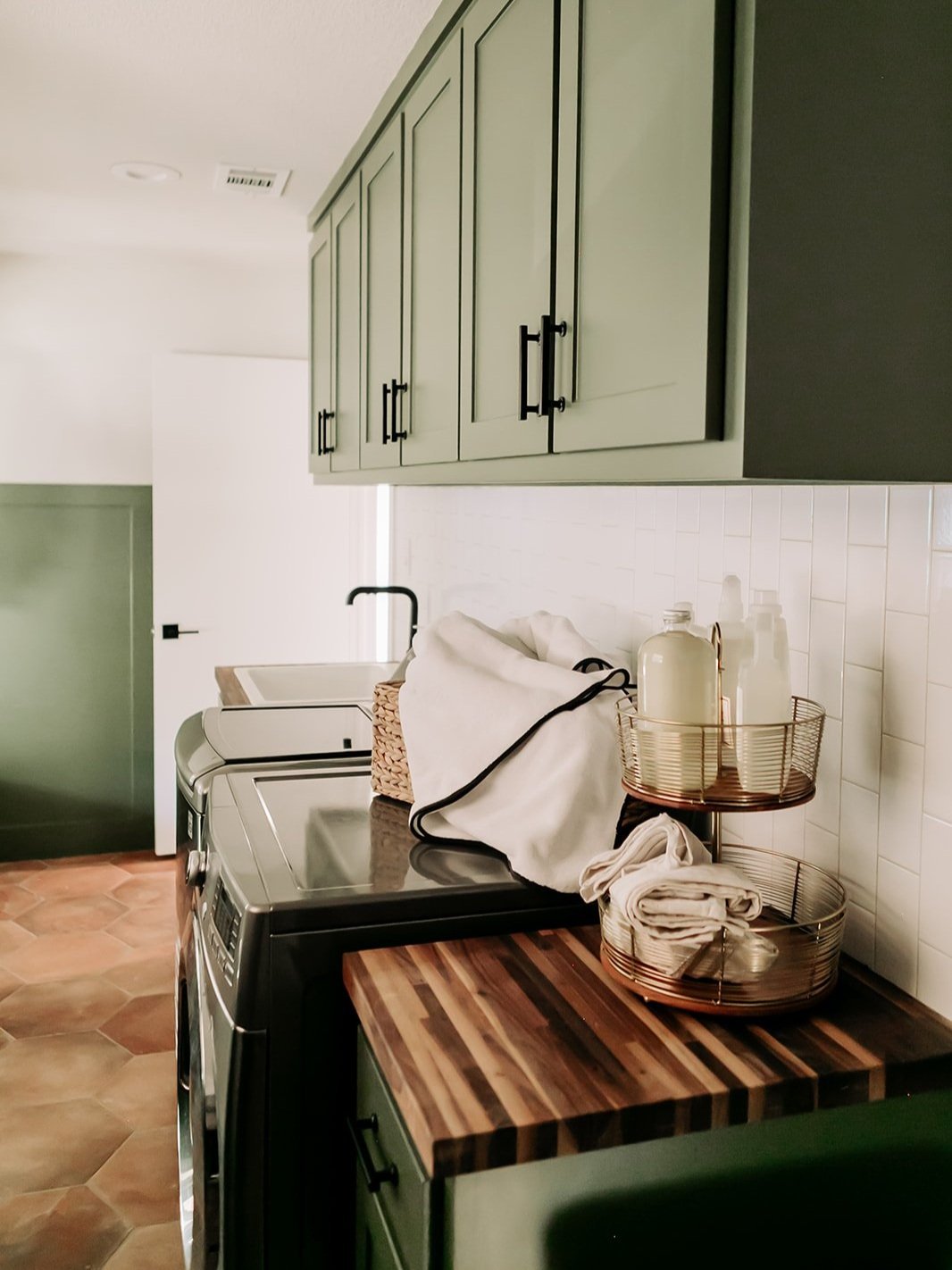
Before you fall in love with the idea of charcoal gray in your laundry room, you need to understand that the size of your room plays a huge role in how a paint color will work for you. Light colors tend to make spaces feel larger and more open by helping to reflect light through the room. Darker colors can make a space feel smaller and more intimate.
That being said, don’t be afraid to use bold or dark colors in small rooms, especially if the goal is to make the space feel comfy and moody. Back to our first point, it’s all about the feel and vibe that you want to create. When in doubt, sample the color first to see how it complements the scale of the room.
3. Consider the light source in the space
Lighting is one of the most important factors when choosing a paint color! A color that looks perfect in the store, or in someone else’s home, may look completely different in your space. That’s right, Pinterest photos may seem deceiving… it all depends on the room's orientation, the amount of direct natural light it receives, and the type of light bulbs used. Let’s break it down!
Believe it or not, rooms with a lot of natural light can show color differently depending on the direction they’re facing. For example, south-facing rooms are flooded with warm light throughout the day, making colors appear more vibrant and saturated. On the other hand, North-facing rooms tend to have bluer natural light, which can make colors appear cooler. To acheive a polished look in your space, you’ll want to opt for warmer tones in rooms that receive cooler light and cooler tones in rooms that receive warmer light! Yep, it’s as simple as that! The last thing we want is for your north-facing room to be covered in blue and green hues… you’re space is going to feel cold and uninviting! Impress your guests with this simple design rule, and I guarantee it will make ALL the difference!
Now, don’t worry, I haven’t forgotten about the other directions! Interestingly enough, East-facing rooms get soft morning light and cooler afternoon light, while West-facing spaces often see warmer light later in the day. I know it’s a lot to process, but ultimately, color will always appear differently no matter the space. It’s totally normal! And guess what… artificial lighting is a contributing factor, too! LED, fluorescent, and incandescent bulbs all cast different tones and make colors appear differently. Let me explain!
While LED bulbs come in a variety of white tones, incandescent bulbs always cast a yellow light and will make your space appear warmer. Fluorescents, however, cast a bluer light and will make your space appear cooler. I always recommend using incandescent lights to enhance warm-toned colors, such as terracotta or creams, to create a cozy and welcoming atmosphere! And, for cooler rooms, use fluorescent bulbs to emphasize a fresh, clean space! To help guide your lighting needs, the graphic below shows various lighting options with the corresponding temperature!

Don’t overthink it! Just remember - the light sources in each room affect the way a paint color appears on the walls.
Pro Tip: In order to choose the right paint color based on lighting, I always recommend looking at your paint samples at various times throughout the day. You can see how the appearance of the colors may be changing as the sun moves and as you turn on different lamps.

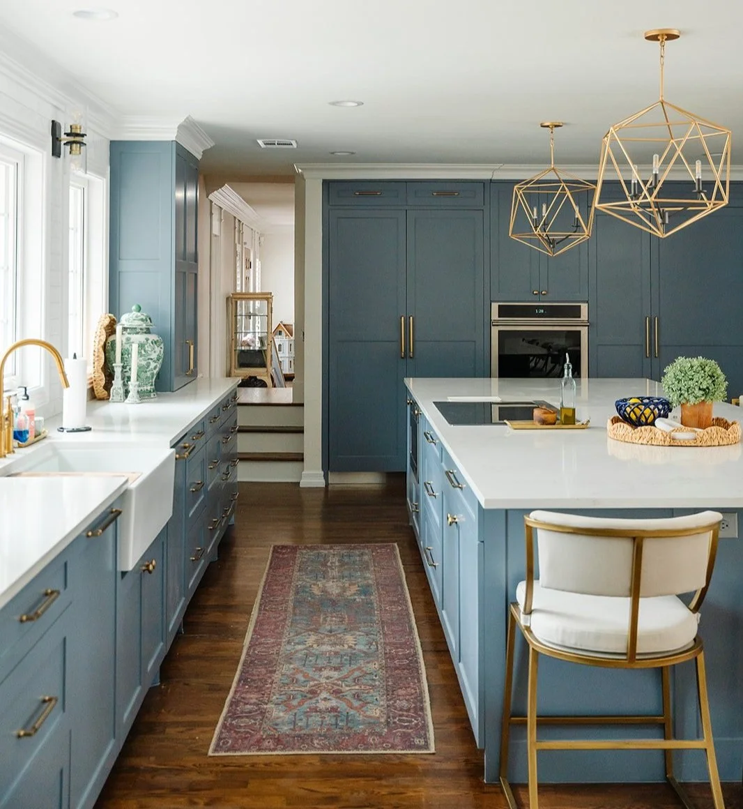
4. Combine complementary colors to create a balanced look
That brings us to a very intentional step of the process - color combinations! When selecting colors for a space, I always choose a feature color and at least one accent color. Stay with me here, the feature color will cover the largest area, so you’re going to want to choose something you’ll enjoy living with daily! For your accent color, which may appear in furniture or trim, look for contrast in tone or color temperature. If your primary color is a pale green, for example, maybe your secondary color is a darker green! By carefully deciding on your primary and secondary colors, you have a built-in guide when selecting colorful accessories for your home! And now, decor shopping got that much easier!
Not sure where to start when picking your primary and secondary colors? Looking at complementary colors is a great place to start because they create visual harmony by contrasting one another without clashing. Complementary colors sit directly across from each other on the color wheel, such as blue and orange, or red and green. If those shades seem a bit too bold, you can also play with muted or toned-down versions of complementary colors to maintain a calm environment. The key is to choose shades that will enhance each other rather than wash each other out!

5. What colors are you most naturally drawn to?
Stay true to yourself! Reflect on what you are naturally drawn to when choosing paint colors. The last thing we want is for you to choose a trendy color that looks great in the space but doesn’t feel like you. Imagine that Barbie pink in your home, but you actually hate that shade of pink! That would be nuts! If you don’t start by loving the color, I can almost guarantee that you’ll get sick of it pretty quickly. Start by asking yourself what your personal style is - are you a maximalist who prefers bright and bold colors? Or are you more traditional and drawn to light blues and moody neutrals?
Pro tip: A great way to narrow down what colors are the most YOU is to go into your closet and look at your wardrobe. What are you seeing? There is a good chance that the shades you’re drawn to when shopping for clothes are the same shades that you’ll prefer in your home!
If you’re still not 100% sure what your color preference is, click below to take our Style Quiz. Once you’ve got your results, take some time to learn more about your style, how to incorporate it into your space, and what color combinations are best suited for you through our Design Style Toolkit!!